The responsive design allows you, as developer, to equally display the content, images, and video on your site independently on the screen size and the power of the device. It helps you to avoid: wrong resizing, inconvenient scrolling, inappropriate zooming and false panning. The main advantage of the adaptive design is the fact you don't need to create a mobile website.
Test any website for responsiveness using device toggle bar from Developer Tools available in the browser
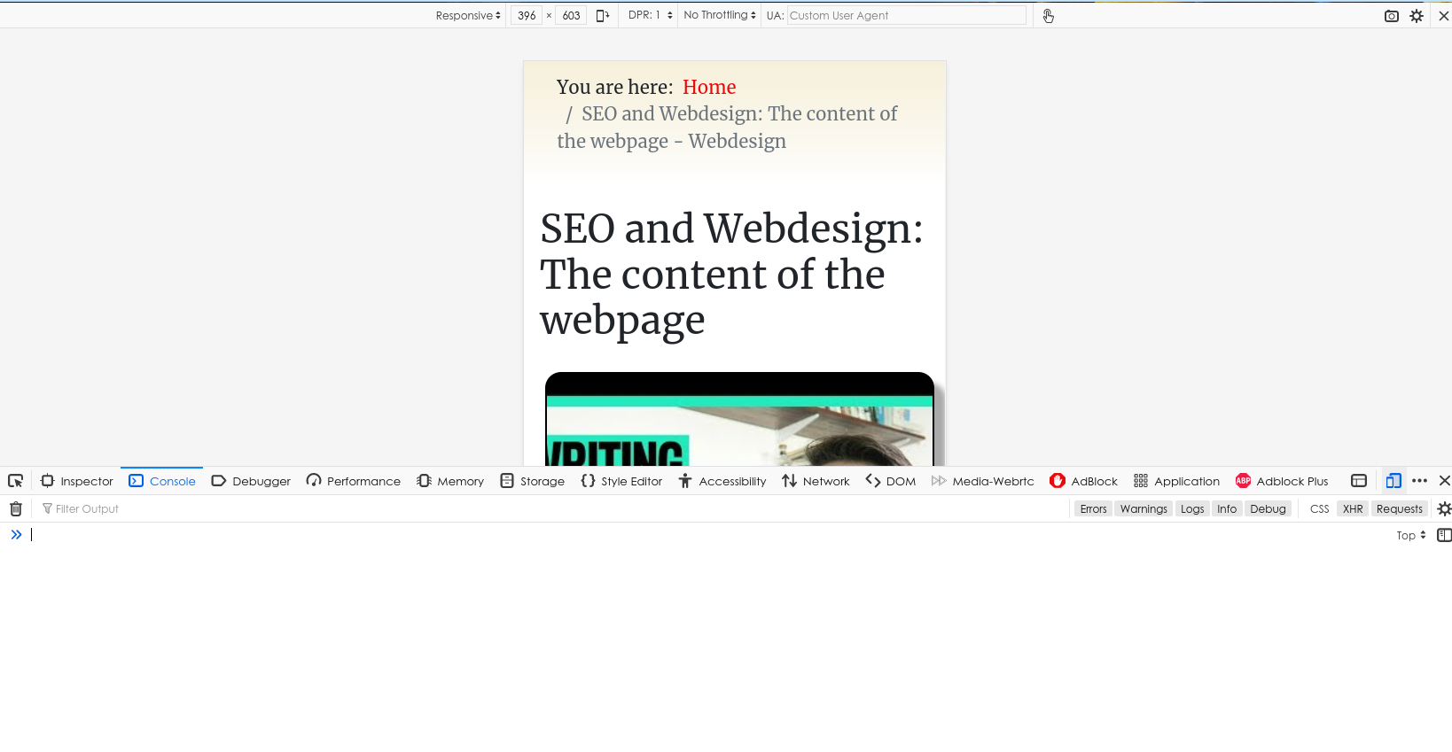
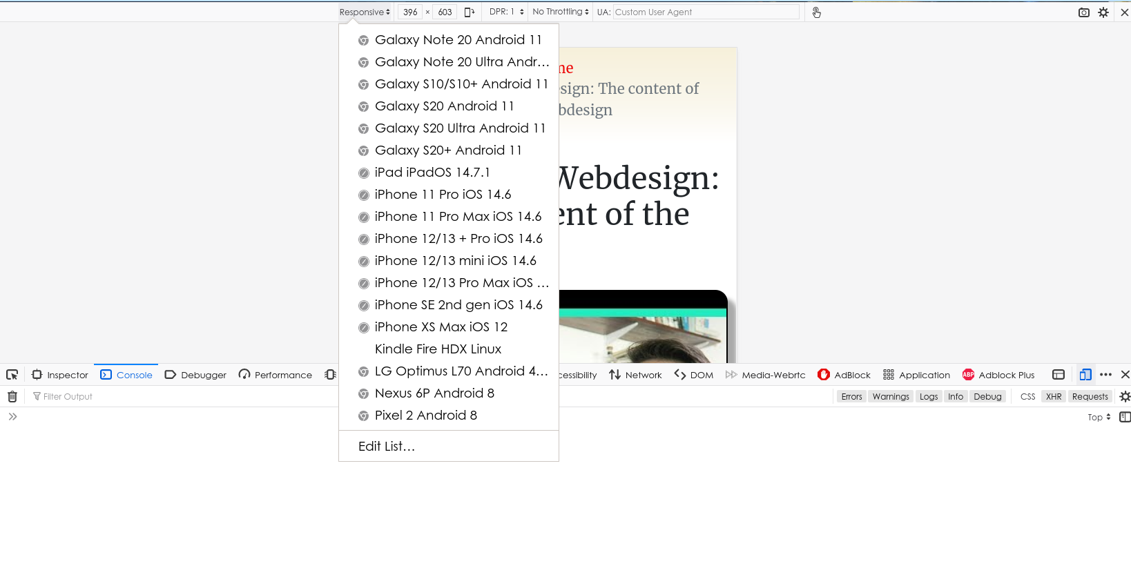
Use the shortcut F12 to start developer tools in Firefox, Chrome and Microsoft Edge and then press on the Toggle device toolbar. In Firefox, the same mode is referred to as the Responsive Design Mode. The image below displays the Firefox Responsive Web Design mode. Once you click on Responsive design mode, you will get a list of popular mobile devices like Samsung Galaxy phones and tables, Nexus, Pixel, Apple iPads, iPhones, etc. This lets you instantly view how the site renders on these devices.Does it change shape when you resize your browser from a desktop computer?
Just try it: open the website in the browser of your choice, ensure that your browser window is not full screen (you should be able to see the desktop behind it), position your cursor along the right edge of the browser window, and resize the window down to the size of a mobile phone display. If the website is responsive the layout should change based on your browser window size, even on a desktop.
For contrast, if you do the same thing with an adaptive website on a desktop, the sidebar (or content on the left or right side of the screen) is simply hidden rather than resized or moved elsewhere.


